b

Artist Journal ~ Next Steps

As my time not only in undergrad, but at Oneonta as well, draws to an end my journey is just beginning. Ive had the fortune to ‘launch’ my professional artistic career with a few group exhibitions, awards and scholarships, and the crown jewel of putting together my own solo exhibition this fall. That show has also led to two separate interviews ive been able to do with on campus media. As well as selling two of my queen prints!! It was an incredible way to wrap up a semester and degree. The biggest next step is going to be applying to grad schools. Ive decided to apply to a mix of MEd programs and MFA. There is an online MEd program that is the top of my list that id start next fall (Adelphi Art Ed.), but if I were to get enough in scholarships and awards i may look into an MFA program first. Either way i wont be starting until next fall.

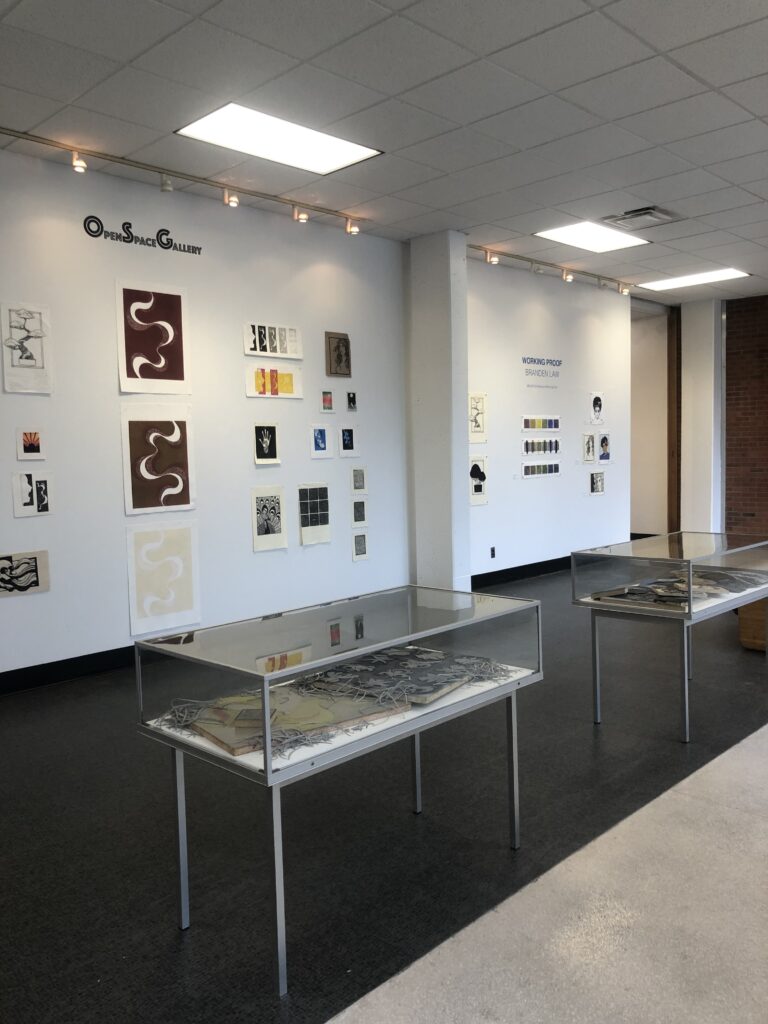
That time will be used to hopefully grow and develop myself further as an artist, I was able to maintain my part time job after graduation so it will give me the freedom and flexibility to not only create more art but also start putting myself out there in terms of applying for shows, awards, etc. I have a laundry list of potential print ideas already started. My biggest obstacle is going to be sticking to a regular work schedule in terms of my art and start taking it more seriously now. I’m determined to end 2022 with another solo exhibition somewhere, ive been compiling a list of galleries to apply to since the beginning of the semester. Luckily ive had the opportunity to work with Sarah, our gallery director, to make both a CV and Resume to start applying to these things.

I’m interested to see how the beginning of January of next year goes be the first January since c.2004 that i wont be starting classes. My mother and I always joke that I’m a ‘career student’ and if money wasnt a factor I definitely would be, I love the classroom environment. I’m going to miss the collaboration and critique, sharing ideas and techniques. But I have a few future plans that will hopefully help fill that void a little bit.

1 YEAR GOALS

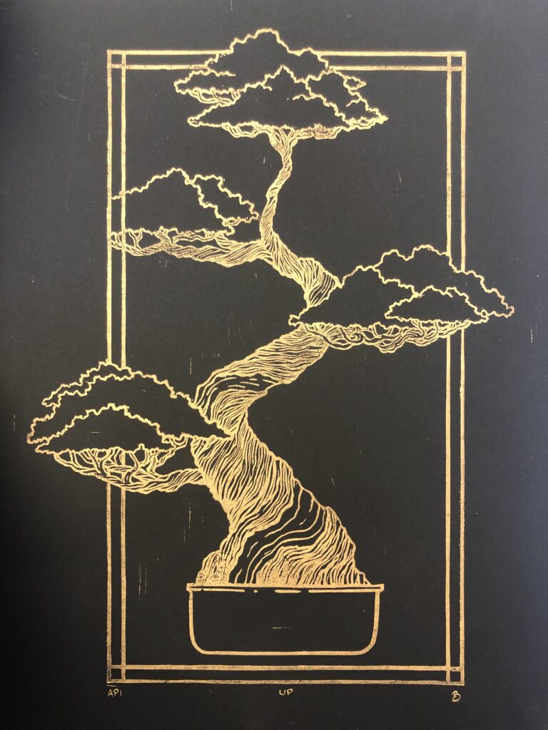
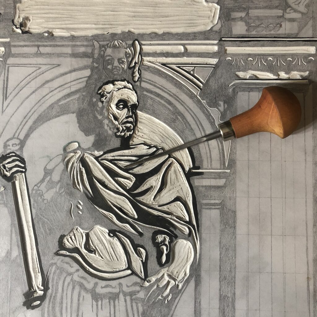
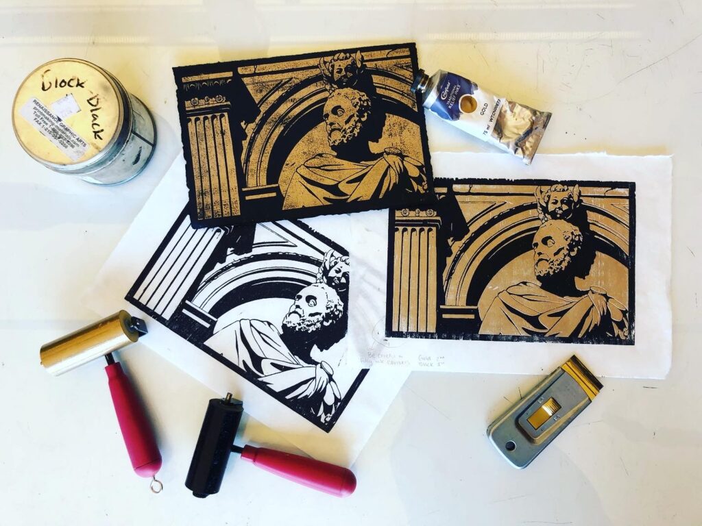
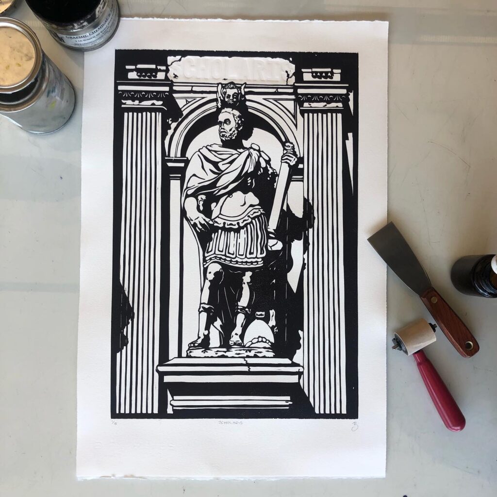
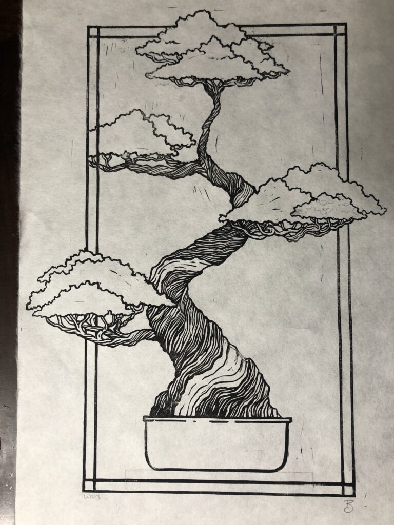
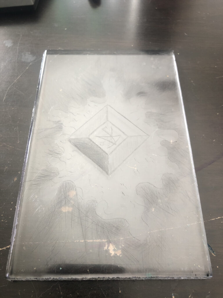
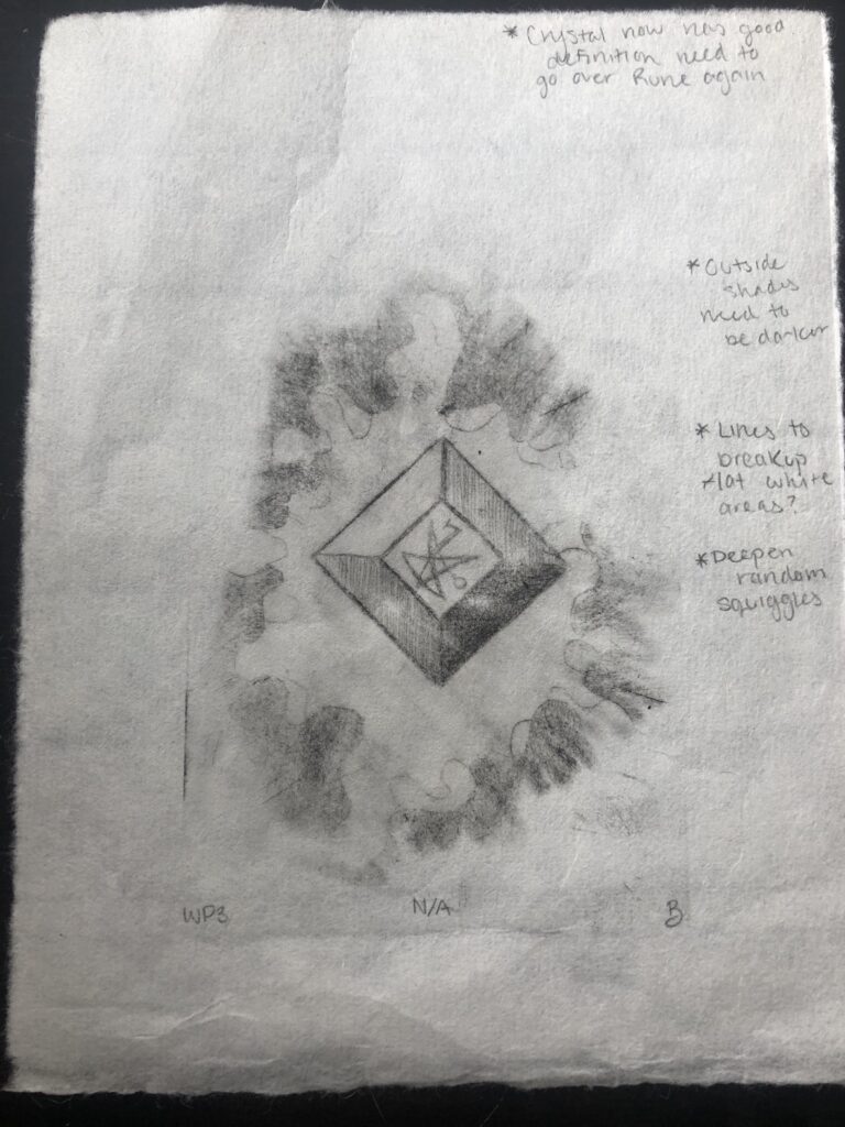
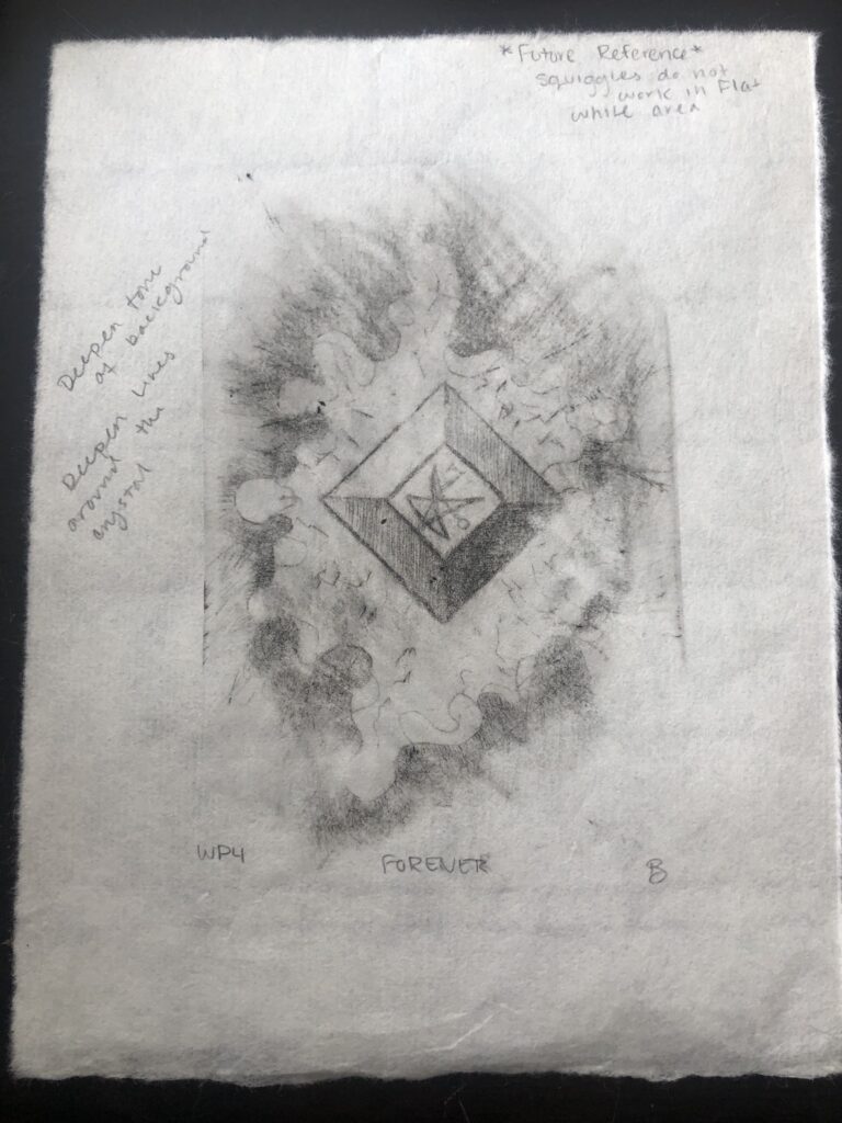
  • Artist Book/Printmaking Edition – The Sun and The Moon
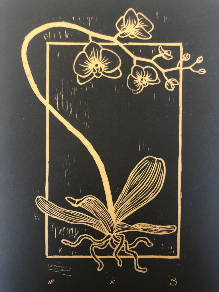
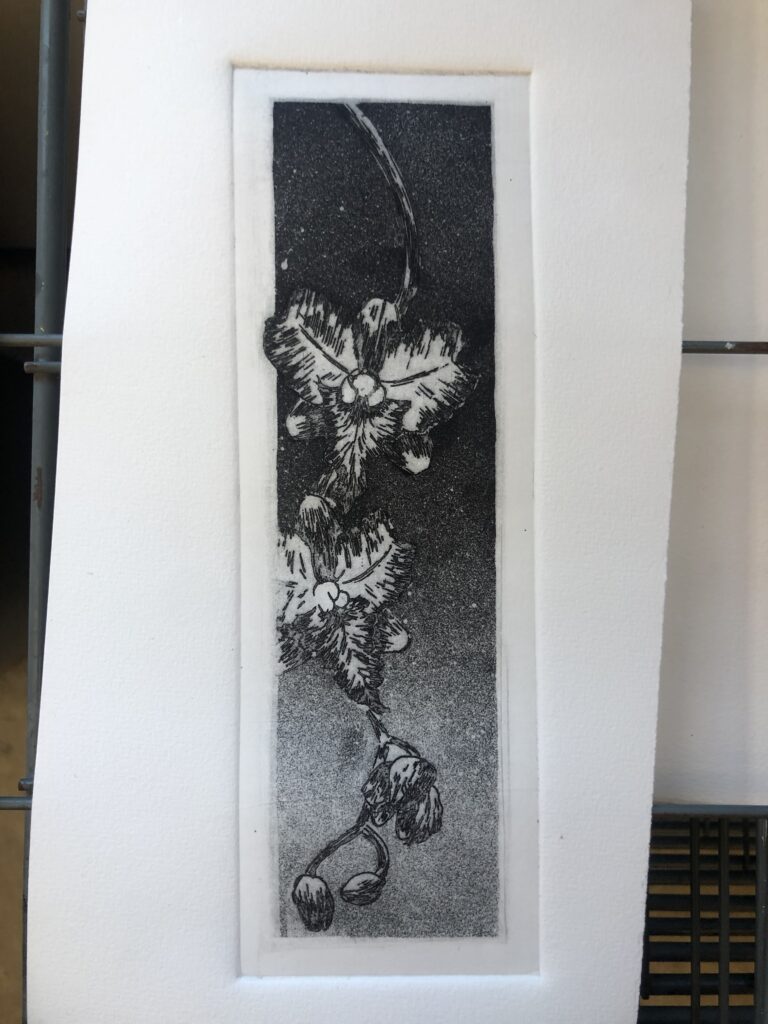
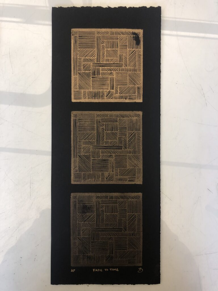
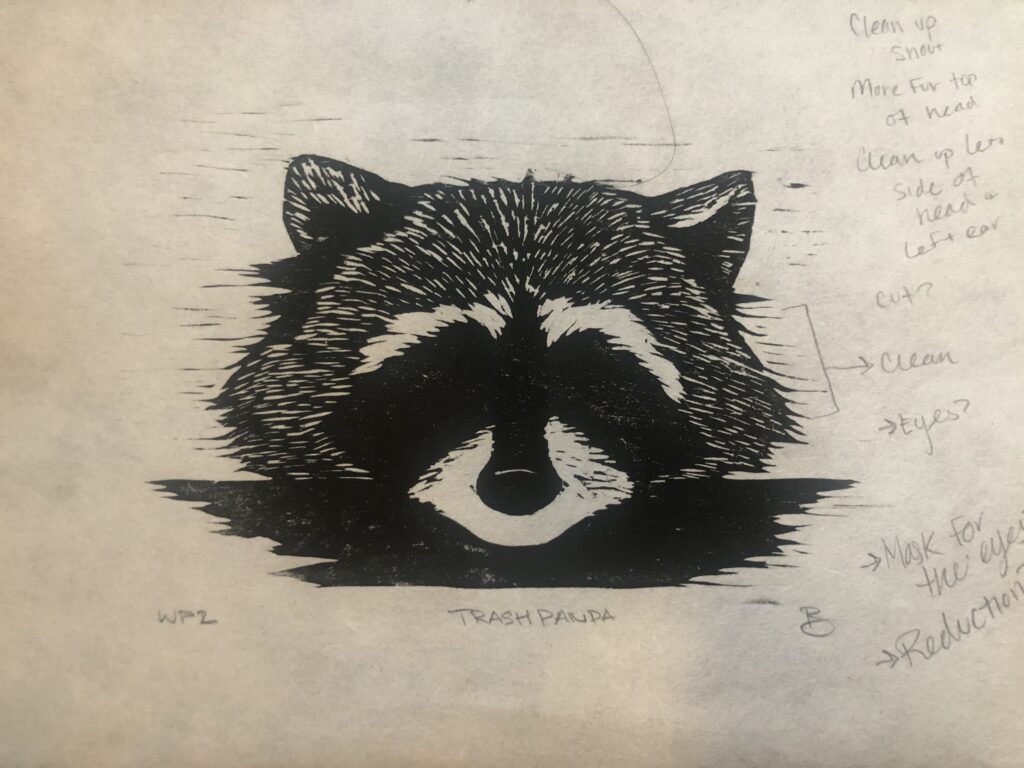
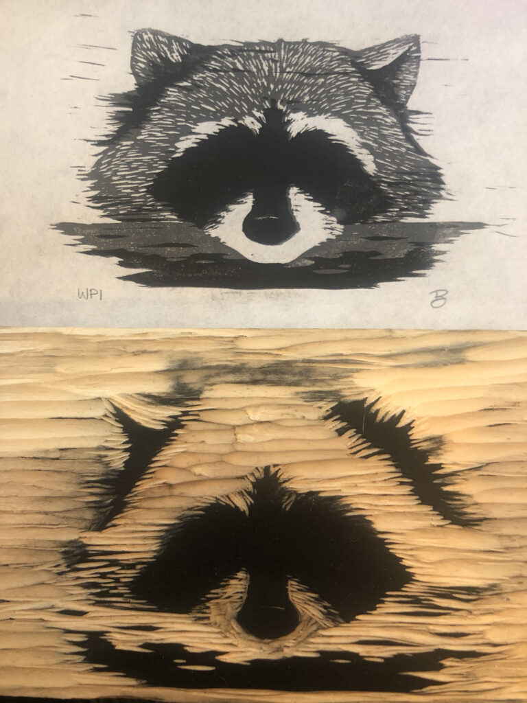
  • Countless Print ideas to start sketching
  • Obtain at least one solo exhibition
  • Be apart of at least one collaborative/group exhibition
  • Apply to Grad School for next fall
  • Coordinate a Print Portfolio Exchange 
  • Sell at least 5 prints
  • Sell at least 5 drawings
  • Have a drawing published
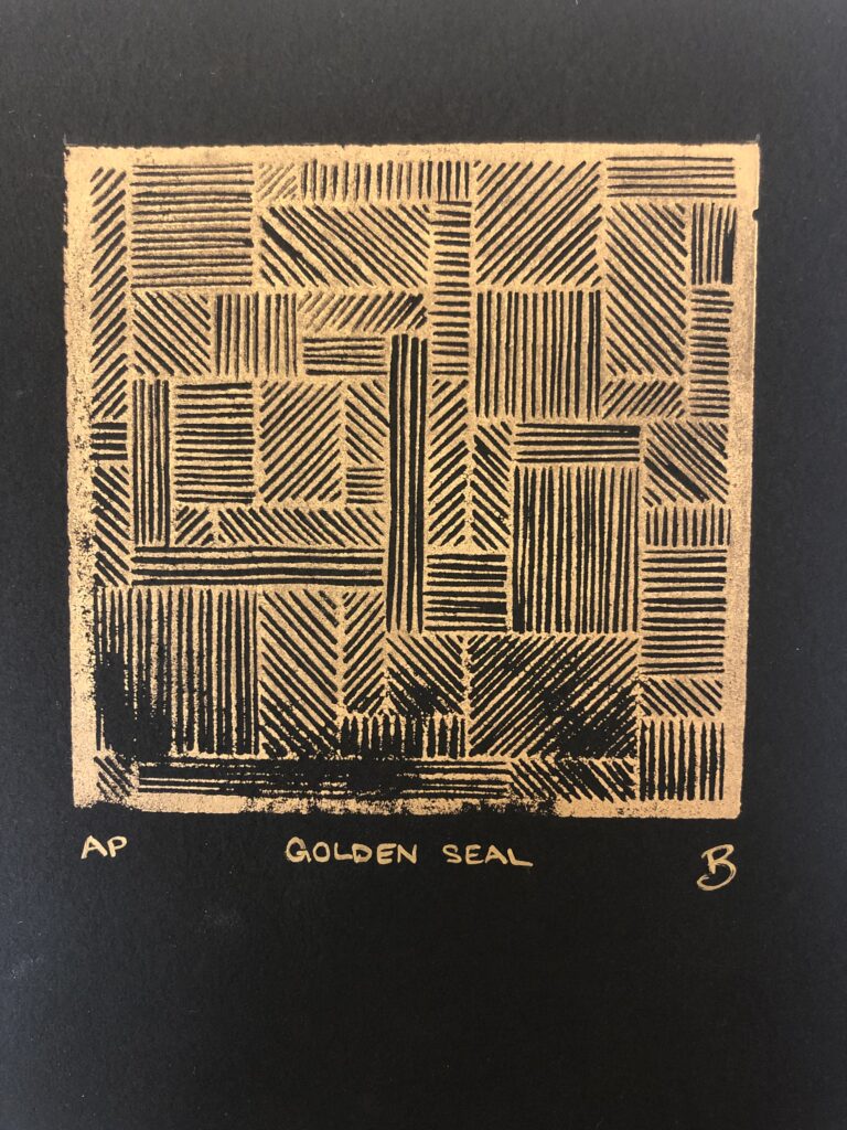
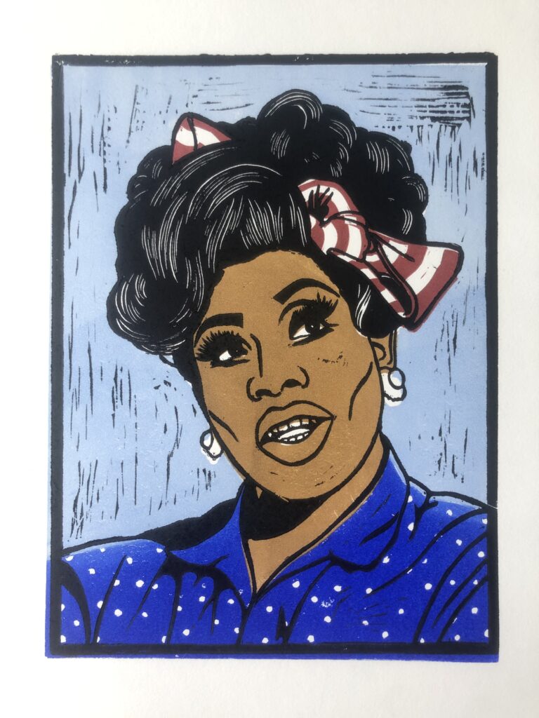
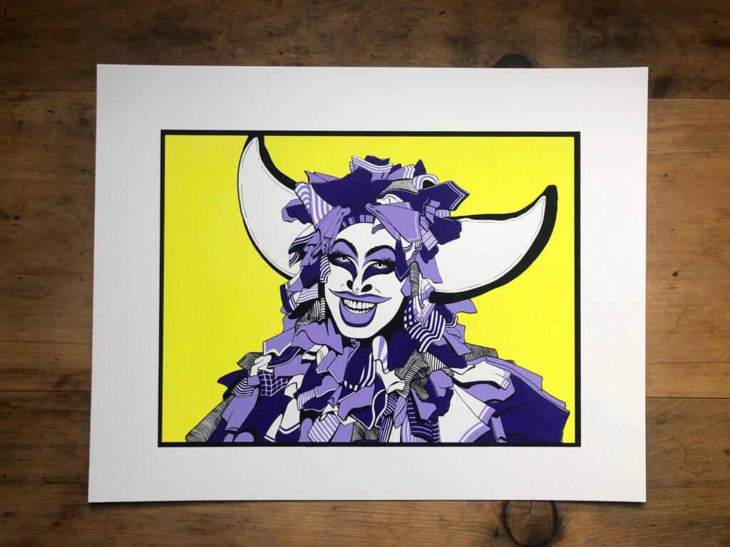
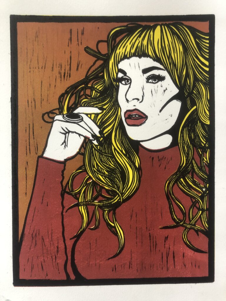
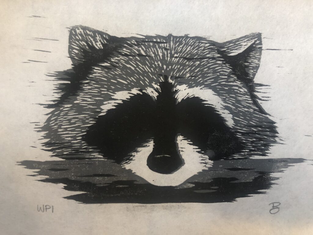
  • Continue working with Silkscreen queens
  • …….see other 95k goals for the next year

Artist Journey ~ Additional Prints

Here are a few of the additional prints I made this semester. Ive had a blast working with my new Cranfield Gold relief ink on black paper. It’s a fun design challenge to design a block almost in reverse since I’m not printing the black lines anymore but instead carving them away. It has also been fun just going back into blocks that were originally designed to be printed in black, like the Bonsai Prints I made last spring. ‘Golden Seal’ was made with the block I use to print the ‘Stonewall’ series, as was ‘Fade to Time’. That last print I experimented with adding trans base to the gold ink, it doesnt turn out too bad on the black paper but when printed onto white paper all it seems to do is dull and darken the gold. I like the bronzey look to the print. Lastly in terms of the additional prints was a last minute line etch/aquatint before leaving SUNY Oneonta. I wanted the refresher and to ensure i retained the processes. I’m happy with all that I remembered and while there were a few hiccups along the way (I may or may not have forgotten to test the acid before putting the plate in). I like how it turned out for a crash and burn print, particularly the relatively clean edges to the print. Ive been really interested in incorporating embossings into my work and while going through an exchange portfolio in class I fell in love with the etchings with a crisp border framing the print. I found it a lot easier to clean edges by doing the blank edges and if given the opportunity and facilities in the future I look forward to potentially translating my illustration work into intaglio plates. The future holds so many possibilities.

These additional side prints have been a true savior this semester, they’ve been small victories and additional puzzles all at once. Allowing me to take a small break from a larger piece to either test a carving method, or design idea, or even just go back to an old blocks that I know will give me a good print to be proud of when a main project just isn’t going my way. It’s a practice I definitely plan to continue to use moving forward.

Artist Journal ~ SCHOLARIS & Using the LaserEtching Machine

As Ive continued diving into linocut prints my current obsession has been with big bold black and white prints with intricate details. Also while going through print exchange portfolios in class Ive become more and more interested in blind embossing. I knew I wanted to find a way to combine the two so while clicking through folder after folder of reference photos Ive taken over the years I came across a photo id taken on a trip to Italy. It was of this large statue with two pillars and the angle I had taken the photo at gives it a kind of looming effect. I do a lot of my drawing and planning on my iPad now and it didnt take long for me to get a design drawn up fort his print. As i started the transfer process of getting the design onto the linoleum block i realized I’m planned a lot of thin lines in the print, it became the perfect excuse to buy myself a brand new carving tool, it arrived just as i was finishing the transfer. In the image below you can see the grid I used to transfer the image as well as the tool. WOODCRAFT Pfeil #11 1mm v-gouge. I wish I had gotten one of these sooner, its such an incredible tool. It fits so well in my hand and the long neck is perfect for the way i hold the tool and carve. I cant wait to grow my collection of these tools.

While I was carving this giant 18 x 12 inch print I got the opportunity to work with David Kenny and use the Laser etching machine we have on campus to make a print. I used a small piece of the design I was carving onto the big block, and let the machine do its work. Slowly the laser moves back and forth zapping away the parts of the design you want to get rid of. We etched two blocks, one that would print all the shadows and another that would print all the highlights so that they could be either combined to create a print or used individually, along with buying myself the carving tool I purchased Cranfield’s Gold relief ink and just like with the tool I am in love. It looks especially gorgeous on black Reeves BFK paper as it’s such a dark rich black. I think this is where the independent highlight block really shined, and working in a reverse fashion like this was a fun opportunity. It’s a technique I want to continue to work with. Below is the highlight block alone, The highlight and shadow blocks together, and then the shadow block alone.

He Who Watches… He Who Sees… & He Who Knows… (Laseretched woodcut, 6 x 9 inches, 2021)

Working on this mini side print was a great motivator while carving the large block. Once it was finally carved I was very eager to get it printed and pulling that first proof was magical. I was really happy with where the print was headed and loved the thin lines I was able to get with the new tool. Once I knew the print was working I set out to work on the blind embossing aspect of the print. In my excitement I made a small hiccup. I measured the area i had to work with, the white area at the top of the print, and got roughly 1.5 x 6 inches. But when I went to design the embossing block I didnt shrink the letters at all, I made them fit snuggly into a box the exact measurements of the area available. I had already fully carved the embossing block when I realized my mistake, so instead of having to carve backwards letters all over again I decided to open up the white space at the top of the print to accommodate the larger embossing block. The print in the photo below is the two combined and I am so happy with the outcome. Ive printed it on Stonehenge paper and look forward to trying it with Reeves BFK, my hopes is that the thicker paper will allow me to get a deeper embossing to really pus the shadows the embossing creates.

SCHOLARIS (Linocut and Blind Embossing on Stonehenge paper, 18 x 12 inches, 2021)

Artist Journal ~ Queen Prints

I get a rush of adrenaline and joy when a print finally comes together, especially ones like the queens that were one of the first serious print projects Ive worked on and continued to expand. Getting to see not one but TWO queens fully realized in color this semester was fantastic!! SUNY Oneonta has offered me so many wonderful opportunities and much like learning how to use the laser etch machine with David Kenny to make a print he also was nice enough to spend a Friday teaching me a crash course in serigraphy (Silk Screen Printing). As that queen (Crystal Methyd, above middle) came together I remarked to David about the adrenaline rush right before printing the last layer, the black outlines. A rough image can often be seen before the final layer just based off the color blocks, but the outline layer really draws the print all together. Something I began to realize over the course of this semester, particularly after pulling the screen print, was that I’m now getting to a place where no matter the idea I have or concept I’m trying to convey I know a diverse array of printing techniques to get me what I want. The queens look best when screen printed, but Stonewall wouldn’t hold the same weight or meaning if not hand printed buy me from a block. I look forward to seeing this collection ‘The Queens of Pop Art’ continue in the future!

Artist Journal ~ Working Proof

Getting to sit back and fully reflect on my time installing, presenting, and then deinstalling my solo gallery exhibition “Working Proof” is still kind of surreal that it all even happened. Its not lost on me how incredible fortunate that I am to be able to wrap up my undergraduate degree with a solo show under my belt. Many changes were made over the course of developing the show. Both of the large reduction prints I planned to feature in the show didnt make the final cut (Although pieces of them were used in the show) and my plan to print on plexiglass so viewers could build a print also fell to the cutting room floor, but I look at both as opportunities for the future. I’d like to take the core theme of this show and expand on it, whether this will be over the course of the next year or the next ten I’m unsure.

Installing a show has a lot more to it than I ever imagined. I honestly thought id go in, pop some nails in the wall, maybe level a piece or two, and then be good to go. WRONG! Luckily the new gallery director Sarah has been gracious enough to show me the ropes and help me along with putting this show together, Ive really enjoyed working with her.

When the time came for the reception I was super happy that I had just done the reception for the Jean Parish Memorial Scholarship exhibition just a few weeks before. It helped shake the nerves of a first time on the artist side of a reception as well as ease into talking about my work and process. The reception for Working Proof as well as the Jean Parish show taught me a lot about myself as an artist and why I do what I do. Seeing how a piece can be interacted with, even if its just a 2D drawing on the wall, is so fascinating to me. Getting to see my work touch people and resonate with them on a personal level was a goal I didn’t know I was striving for. The show was also a sort of starting point in my journey as a ‘professional artist’ both in terms of physically putting my work out into the world and giving me the confidence to branch out more and apply to more gallery shows, but also it’s helped me start to brand my self on social media. Ive been doing pretty good with posting to instagram regularly and by the end of 2021 I’m determined to have a full website up and running. This show was an absolute blessing and I am incredibly honored to have been given the opportunity.

Artist Journal August 23-August 29

Ive never been so excited to wake up at 5am to drive an hour but walking into the studio for the first time in over a year was like a weight lifted off my shoulders. (And not just because I’m lazy and dont want to print by hand anymore). I didn’t even have much to work on but I was sat down at my usual table by 7am…. For my 9am print class. I love being in the studio early in the morning. Most college students don’t seem to be early risers so I am usually one of the first in the building. I get to dance around the studio singing and having a grand ol’ time (Which I’m surprised no ones ever come knocking asking me to keep it down) and its so peaceful. Not to say i dont also enjoy time in the studio with other people working, particularly as ive progressed into the upper levels of printmaking getting to see the print 1 students working on their prints and getting to be there to offer help.

This is my last semester at Oneonta and true to form I’ve made sure to pack a plate high. Ive been Incredible fortunate enough to have a few of my pieces featured in The Jean-Parish Award Gallery Show this October after receiving the scholarship last fall. Additionally I’ve been granted the opportunity to put together my own solo show this semester. Printmaking has provided me the opportunity dive deeper Into my creative process as an artist and while I still am very much a ‘product’ based creator printmaking has given me the chance to include the process In the product. This concept is the basis of my solo show titled ‘Working Proof’, the label given to prints that are part of the journey to the final piece and will not be included In a final edition. 

In the span of a little over a month I have to…

-Complete start to finish the 5 layer reduction print that will be the focal point of the show, I’m going to save one piece from each layer i print so viewers can see side-by-side how the layers build. 

-Complete a layered print on sheets of plexiglass that will be free standing in the gallery space for people to walk around to see the layers of the print, as well as stand In a specific spot to see all these layers merge together to create the final print. 

-Complete a mini version of the plexiglass print for gallery viewers to hold in their hand to be able to build the print themselves

-Reprint any previous prints that aren’t the quality I’d like on display.

            A monumental challenge? Yes. One I’m so beyond excited to tackle and accomplish? A BIGGER Yes. Ive kind of split my semester in two in terms of my printmaking course and up until the beginning/mid October it’s all about putting this show together and then getting it set up in the gallery. Then once the show is up and set I get to take a deep breath and start to really play with my printmaking (I absolutely love the work I’m doing for the show but there’s so many techniques and materials i want to mess with that will have to wait. Printing on darker paper, printing on unconventional things, mixing in some artist books practices, etc. My biggest challenge in the first half is time working against me, It’s a tall order in a month and I also have other classes that I need to spend some time on. The second half my challenge will be ensuring that while I’m playing with these new materials and techniques I’m still designing and executing finished pieces that I’m proud of and hopefully have some sense of cohesion with each other. Luckily i love to schedule and plan ahead so Im confident in my ability to stay on track for the show. This semester is going to be so much, and I’m so excited to see how much i grow as a person and an artist. I’m getting first hand experience working with a gallery director to put together a show and getting to continue exploring all that relief printmaking has to offer. 

Student Teaching Wrap Up & Overall Updates

Wow… the last month or two kind of got away from me. Classes and life both ramped up at the same time it seems, seems like only a week or two ago i was writing my first post on here and now I’m wrapping up my Teaching Assistant course with the Print 1 students. As part of the final students are asked to answer some questions about their experience with printmaking throughout the semester, as well as how their predictions from the first week of classes turned up. I had answered similar questions in my first post way back in January. Overall while I think I was being a tad dramatic about the difficulties of me reacquainting myself with some methods I hadn’t worked with in a few semesters. There was a slight hill I had to climb in the beginning of the Intaglio project but my earlier guess was correct in that printmaking is like riding a bike, once you learn you can never really forget. My biggest goal was to be able to get a sense of whether teaching at the college level is something that would appeal to me as well as really be able to help the students and feel like i taught them something. I feel as though throughout the relief projects in particular, especially for those who chose linocut, i was given this opportunity to share the tips and tricks ive picked up in my short time as a printmaker. They say everyone wants to feel important and i feel most important when I’m given the chance to help a student and further their passions. I’m ending this semester with new questions for myself. Before high school was really the only area ive been interested in teaching but now after getting to work with Rhea the opportunities for student development and engagement at the college level is something I definitely enjoy. With the start of summer break fast approaching I have many plans on the horizon for the coming fall and its going to be full steam ahead as i move into my final semester of undergrad.

In other news I’ve started work on a new print series that I will be working on over the course of the summer into the fall semester. I’m focusing on Bonsai trees, their diversity in form, texture, and movement through linocut prints. Here is a test print from the very first in the series. I’m unsure of if this print will make it to the final collection or if it will simply end up on the cutting room floor as a test print. Which wouldn’t be a complete waste especially with another project i will be working on going into the fall semester of putting together a solo show of both my personal print collections as well as the process of printmaking from design to the drying rack. I’m really looking forward to this and am hopeful that I’m awarded the ability to produce the show.

Up

12 in. x 18 in.

Linocut on Mulberry paper

2021

Artist Journal 5 ~ March 1-7

This was a very busy week, It always seems like I have 17 deadlines all at once. It is one of the unfortunate downfalls of being an art major. Generally professors do 4-5 projects over the course of the semester which results in many deadlines lining up. Luckily in terms of the class I’m a Teaching Assistant in the students have moved on to their first choice project. They get to choose to either work in intaglio drypoint like the first project or work in relief woodblock like the second. I’m using this time to make sure I stay on track with my own work while aiding the students with their designs. In terms of my own work I’m currently juggling a drawing for my Advanced Design class as well as a book series for Artist Books. Both of which have been slow going to start but are really starting to gain momentum. I also need to begin work on my next project for Digital Painting. This class is interesting in that its asynchronous, there is no set meet time for the class as a whole. It feels like an independent study which has its good and bad. Ive done independent studies before but in areas/materials I was more than comfortable with. I don’t have a lot of experience with digital painting so its been a trek so far. Ive been lucky enough to have great professors who are always there to help and it makes things a million times easier. I do know that I have got to be a little more disciplined with this class moving forward so I dont fall behind.

Artist Journal 3 & 4 ~ February 15-28

WOODCUT PRINTING!! Finally being back on familiar ground feels so nice. We have moved into the ‘crash course’ on woodcut prints. This is a method of teaching that I quite like, giving the students the opportunity to try a material and see what they can do with it before really getting trenched in what a woodcut should be. Doing a woodcut in roughly a week often feels clunky and like there are a million and one issues but the students come up with the most brilliant solutions to these road blocks. By the time they get to their second woodcut where they’re given more time for designing and planning as well as execution of the prints the entire process seems less daunting for the students.

I worked on my own woodcut alongside the students and came up with this little raccoon design. The prompt they’d been given was to show their ‘Avatar’ some form of representation of themselves from spirit animals, deities, and portraits to scenes they resonate with. Its always interesting to see the paths they take when given an open-ended prompt like the avatar. Raccoons are one of my favorite animals and I thought it would be the best way to demonstration some techniques with woodcut carving as well as planning and designing for a woodcut as it deals more in shapes rather than line. Part of this project Rhea gave me the opportunity to do a live demo, my first for a college level course. It’s crazy all the little things I do while working on my own prints that are so second nature I’d forget to mention them, luckily with Rhea I was well guided and like to think my first demo didnt go half bad. Additionally I was able to push this woodcut a little beyond the project and show the students a glimps of the type of printing i myself have gotten into a lot lately. Reduction prints. Using the same block and layering colors to get the finished print. I did a quick and easy 3 colored on for my raccoon (I say 3 because i include the paper tone when i count my colors),

Artist Journal 2 ~ February 1 – February 7

This is my second entry and I am already stumbling, but I’m determined to get the hang of keeping a blog and getting my thoughts down not just for my own use in the future but perhaps my trip ups will aid someone else. This is also teh (<— if you see this just know I meant to type ‘the’ and for what ever reason muscle memory has now made my fingers want to hit the ‘h’ last, I will try to edit these as much as possible but that tends to be my most common and overlooked mistake) second week of classes. It’s strange the way my brain looks at tasks, while I am a TA in printmaking and it is technically a class for me I dont have the same drag to work on stuff for it or wake up in time to hold my own version of ‘office hours’ for the students. Instead Mondays and Wednesdays I’m up before my alarm ready for the day. I experienced a similar situation roughly two years ago now when I was give then opportunity to student teach at my old high school. It’s crazy how when you truly enjoy your work it no longer feels like working. These situations have only solidified my desire to be a teacher in the near future.

Currently in the Printmaking 1 class, an intro into various printmaking techniques and methods, the students are working on drypoint prints, and intaglio process where a sharp scribe/needle like tool is used to scratch lines into plexiglass (What the students use) or more commonly metals such as zinc or copper. These scratched lines then act as little trenches to hold ink. The intaglio process is the most closely related to drawing as the marks you make on the material is what will print, as opposed to relief printmaking where it is the surface left over that makes the print. This isn’t a form of printmaking that I have had a lot of experience with since I myself took Print 1 almost two years ago, but its been a fun experience being able to work along side the students and see what theyre coming up with and to see how they individually respond to the materials, ive found it hard so far getting out of my relief printing mindset. David, our lab tech for the studio spaces, made an excellent point about the importance of understanding the style of printmaking youre using and what type of print it will give you. Dry points often have a scratchy jagged quality to them as getting smooth lines and flat areas of value can be difficult. This is why I believe Davids wolf print turned out so well. He leaned into the dry point and what it could give him and in the end he made a print that has a Erie sort of life to it, every time I look at the print i feel as though I’m out camping in the winter time (Something I’d never actually do unless its in a well heated cabin) and then through the almost whiteout snow you can make out the figure of a black wolf staring back at you. It’s a very successful print in my eyes. I went with an amulet design with a sigil in the middle and most of my issues came from trying to work against the material. I am enjoying how its turning out so far tho and am excited to continue pushing on it.

css.php